by Philip Merrill - January 2017
Few things in life are simpler than forks, knives and chopsticks but they are taken for granted as are fonts. These implements are created for beauty and utility as are pens and brushes, and their artistic design involves aesthetic choices as do the font displays that support almost all branded advertising. The physical creation of everyday things has been a marvel of humanity and that includes computers, networks, smartphones, forks, knives, chopsticks, pens, brushes, and unique things only a creator can express. Many designers select which fonts to use in special ways, reflecting the kind of conscientious care Albrecht Dürer probably relied on. Million dollar ad campaigns and Christmas thank you notes have this in common to some degree. Authors really care how the fonts look for one simple reason – while text gives written communication a meaning, the fonts give it a voice!
Digital fonts depend on specified arrangements for their bits, and real businesses spend real money making things possible so their customers' font options stand out as compelling benefits. Long ago and well before MPEG got involved, incompatibilities between electronic messages and display equipment were markedly inconvenient. Some could complain that inconveniences remain however our smartphone-dotted globe has made digital communications easier and font use more reliable because of a widespread adoption of underlying technology known as Open Font Format (OFF), which found its home as part of the MPEG family of standards. MPEG serves as a kind of think tank. There must be a place in an ideal world where people who know how a kind of thing gets made or done can get together to agree on best practices. Often the best practice is a compromise that lets everyone get on with their work separately, with confidence their labors benefit from what they learned by sharing their experience and insights with other experts.
The technology that became standardized as OFF has been known as OpenType, which enabled the simultaneous support of PostScript and TrueType. MPEG provided the international forum so that Open Font Format could grow and be developed as an open standard, as a result of collaboration of technology experts, linguists and graphic designers. Work began with the initial technology submission in 2004, resulting in the first OFF standard published in 2007.
Over the next two years a second edition of the standard came out. By that time, the adoption of the OFF and scalable font technology in general became widespread, which led to the emergence of many new developments including W3C Web Open Font Format (published in 2010), for which OFF specifies the data representation while WOFF defines transfer and packaging mechanisms to deliver web fonts to a browser. As is usual for MPEG, people involved in OFF development comprise an eclectic mix of experts from different walks of life and the work is done in close collaboration with other industry standards organizations such as the W3C and the Unicode Consortium. A third edition supporting color fonts and mathematical formula layout was released in 2015, and a fourth edition supporting variable fonts is currently being worked on.
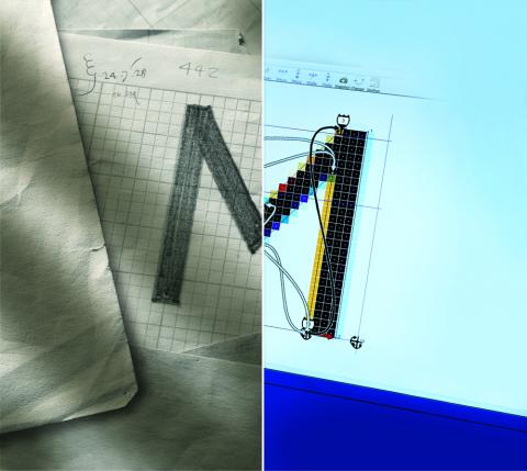
A cursory review of elementary horizontal and vertical properties of font glyphs reveals some of the challenges faced by the font community regarding what scalable fonts make possible. With Unicode supporting many languages and writing systems the independent glyph representations can be very complex; however, it is font engines' responsibility to be able to render them on a grid of pixels. In the ideal world that we cultivate using our imaginations, a glyph enjoys some properties of perfection so the hope is that staking it out on a grid does not ruin its form. Preserving the original design fidelity while insuring that vertical and horizontal elements of a glyph remain uniform in width and height, ensuring that each individual glyph retains its legibility even at very small sizes is a task of enormous complexity. It was made possible by applying programmatic hints that were long ago introduced in OpenType and OFF.
A simple example of using Chinese text in addition to English offers a good illustration of the challenges we face. Scaling issues are potentially more sensitive since many Chinese characters use many more strokes than Latin glyphs, and would need more pixels to represent them. A certain square size can be imagined to minimally represent any Chinese character, and making sure that text can be read legibly is a concern of authors. This is why font hinting is so important, for example, it allows programmatic implementation of intelligent stroke reduction techniques that ensure legibility of complex glyphs even when faithful representation of all strokes is not possible given the limitation of a particular screen and selected text size. With a variety of devices including a variety of smartphones that support different screen sizes and resolutions, managing the quality of text layout and rendering in multiple different languages is a difficult task. This is just the sort of thing that OFF addresses and it is a delight to the font community that their efforts now support global human communication in a fashion considerably more ideal than in centuries past.
As far as font variations are concerned, the technology that is now being added to OFF promises many benefits with great potential. One benefit is redesigned support for font families. Many pro-level typefaces come in a variety of weights (from ultra-light to heavy super-bold) and widths (from extra-condensed to ultra-wide). Combining these multiple fonts in a single font file and enabling font rendering engines to select and reproduce a particular instance of a font, at the time of rendering, makes it possible to fluidly support dynamic layouts. For example, an author might choose for an article published on the web to be read in columns when device orientation is landscape, but have it switch to a single column layout (and a different font weight/width) when the device orientation is changed to portrait.
Weight and width are just two of the many options that can be made variable. The typeface design itself can be varied depending on device resolution and selected text size. For example, a typeface can offer intricate glyph designs for higher resolution screens and/or larger text sizes, or sacrifice design features for the sake of simplicity to keep text readable and legible on smaller screens. Font variability can be defined independently for each glyph outline point using arbitrarily applied delta vectors. These variation vectors can be grouped on multiple arbitrary axes of variability. As a result, the visual effects of font variations can be endless and should enable some novel features that nobody ever imagined, yet.
It is a standard developer's vocation to make things possible for users who are the ones expected to finally use the forks, knives, chopsticks, pens, brushes and digital fonts. The extent to which Internet traffic is now dominated by video traffic gives real satisfaction to MPEG developers who lent more than a hand to that novelty of our everyday life. With international language support and the still developing international standard of Open Font Format, many barriers have fallen so that people in our more connected world may easily become authors themselves. Social media is just one example where the writing systems of many languages now merge seamlessly every day.
Special thanks to Vladimir Levantovsky, who contributed to this report.
Go to the MPEG news page